Some years back, Perit Angie Sciberras was approached by a young couple, an accountant with a love for classic cars and a lawyer/book lover, who purchased a 1980s residential property in Rabat and wanted to transform it into something more modern and fitting for their needs.
So, the architect and interior designer kickstarted her usual design process, building a good brief about her clients’ “dreams for space today and tomorrow…” And the project, involving also interior finishes and furniture selection, took off from there.
Of course, this approach meant multiple decision-makers in the mix and the difficulty that comes with pleasing everyone, but Angie says she has always found that “architecture has a little psychology entwined in it” as well.
“You need to establish harmony between infrastructure, function, form and beauty. And you need to do that while trying to ensure the design lives up to the aspirations of anyone who will live or work within it.”
Admitting this is not easy, Angie believes it can be achieved by actively listening to and looking at the space objectively.
“Rather than stipulating what the design should be, I absorb their ideas and attach them to my experience and expertise.
“When clients brief me about their plans and ideas, I do not take the conversation at face value. They may be more focused on what they want to achieve now, but I feel functional design needs to look beyond that.”
Angie took everything into consideration so that “the outcome can live well into the future”.
In her Angie the Architect studio, she leads a small team focused on designing space that can be enjoyed, used, loved and admired.
It is about customisation; but above all, it is the integration of a client’s personality and brand that influences her process.
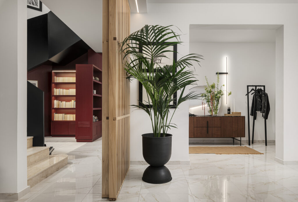
Hints of division
As regards structural changes to the building, Angie explains that the thinking in the 2000s up until quite recently was that open-plan spatial design was the way to go.
But today, that is not always best practice, Angie states, adding that the building’s sustainability and the environment – how much it will cost to heat or cool such large open spaces – need to be considered.
“Sometimes, people also need escape areas to focus, to rest, to cook, to entertain. It is hard to do that in an open space without some level of confusion to the eye,” she continues.
“Just like our lives, spatial design needs hints of division. And we also had to consider that the building had no garden – usually a focal point that would call for more open-space planning to allow the view to be enjoyed from all areas.”
Without this feature, attention was turned to designing rooms with specific, unique purposes, introducing contemporary design treatments such as squared-off walls.
Angie, who worked with structural engineer Perit Robert Ellul Sciberras, also felt it was important that the entrance to this home from the garage was given equal importance as that from the road.
“When you enter a home, you should feel intrigued, invited and positive – no matter which entrance you are using.”
A floating, sliding door, made from slats of solid wood, was commissioned, enabling the homeowner to separate the formal dining from the living room for everyday use.
This also helps to prevent their pets from accessing the dining room and avoids heating/cooling a space that is not frequently used. When entertaining, however, they can open the door and allow the full space of both areas to be enjoyed.
The design and type of lighting used was chosen purposely to enhance the divider and its natural wood, as well as to create an interesting play of light and shadows through the slats.
It was a feat to create something sturdy enough not to shake without a floor rail, a tripping hazard, but Angie believes it is the smaller, often unnoticeable details, that really excite her.
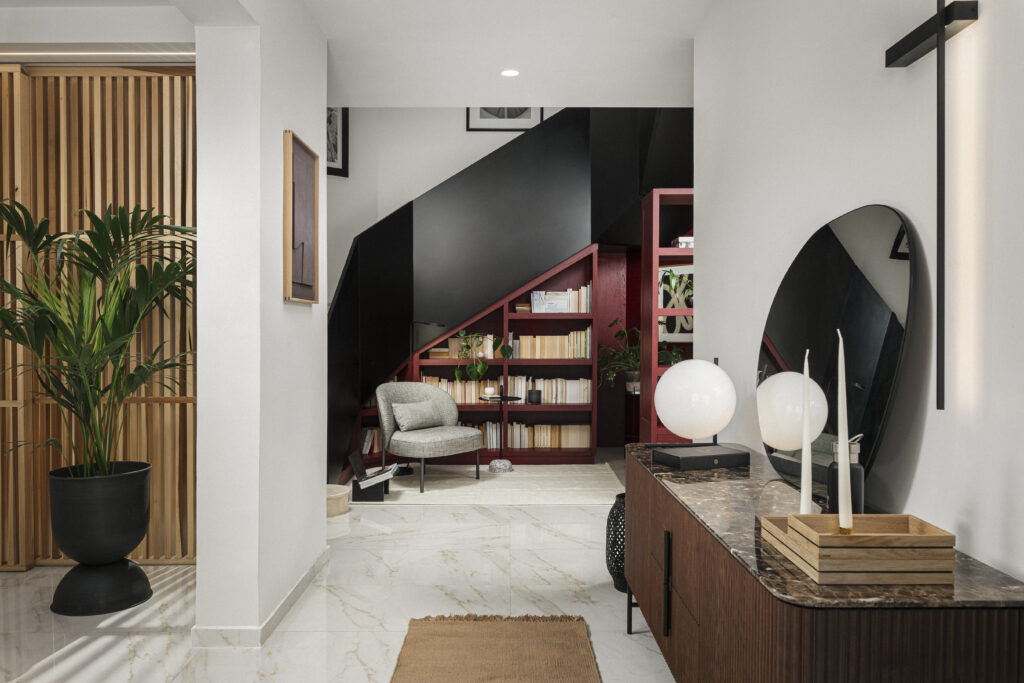
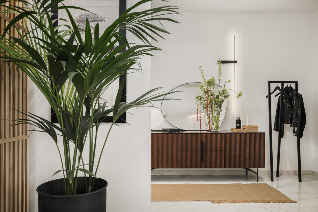
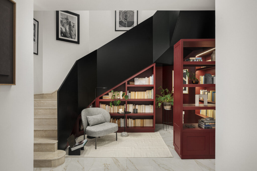
The heart of the design concept
The staircase of the Rabat residence, with its ultra-bold treatment, is probably its pièce de résistance – “the heart from where the design concept began”.
The centre of the home, it is visible from every room on both the lower and upstairs floors and also from the main entrance.
“It had this natural presence and grandeur. It demanded to be the centre of attention and I did not want to reject that feeling, but rather, explore it further to see where it might lead the design,” Angie says.
The staircase also had very unusual angles that gave the space an almost sculptured feel, so it was decided to give it a customised treatment by creating a banister out of sprayed MDF.
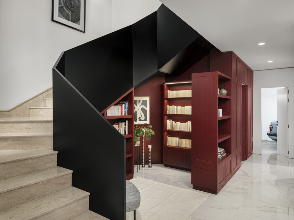
The form was cut on site to ensure a perfect fit all the way up and to be able to see the angles in place before finishing it off site and bringing it back for installation.
By using a very specific tone of black – solid but with just a little shine – natural light was allowed to play off the finish, making it feel and look sculptured.
“While it is bold, it really reflects the energy of the home itself – strong, future-focused, interesting and exciting. It works especially by keeping the double-floor height of the staircase rather than closing it off,” Angie says.
“It pulls you in and guides you through the flow of the building, without overwhelming you.”
Maximisation is a must
The maximisation of the space under the staircase with the library was a no-brainer for Angie.
So often, spaces are under-utilised or missed in the design process, she points out, adding that she always aims to “maximise what I can to give people, such as the option to have nooks and crannies that offer purpose and escape”.
Angie’s client loves books, so the custom-designed little library and reading nook were created from solid wood by Joinwell, especially to accommodate her passion.
Angie also brought in colours – in defiance of the fact that designers have spent years “playing it safe”. Whites, creams and neutrals were the way to go and even textures were predominately cool linens and cottons, she maintains.
This was mostly because they allow the space to temporarily take on the personality of the people working or living within it, providing a smooth transition if they move on and others come in.
“But I challenge this. Colour is a statement – an extension of a personality or a brand. Colour evokes a reaction: warmth, focus, calm, pleasure. It is a feast for the senses.
“And when you are designing a forever home, somewhere a family intends to stay for as long as they can, you should not be afraid of introducing colour into the design.”
“And when you are designing a forever home, somewhere a family intends to stay for as long as they can, you should not be afraid of introducing colour into the design.”
Admitting that this extends the design process and that she lost count of the samples and swatches she went through to get the perfect black and burgundy, the end result is “so striking” against the slightly off-white walls.
On the other hand, more neutral tones have been used for the bedrooms because these are a more personal space, often decorated with the inhabitants’ own memorabilia.
The inviting green of the kitchen, hunted down in collaboration with Joinwell, is exclusive to the project and unavailable off the shelf, while customised cupboards, units and a seating area, as well as the introduction of soft lighting, complete the experience.


“Kitchens can get messy, and when my clients started this project, they were very clear about wanting this and the dining area to remain separate.
“By keeping the kitchen closed off from the rest of the house, it became cosy, safe and calm. It is somewhere you want to cook and eat in – or simply be…”


